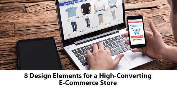
The design of an e-commerce store plays a crucial role in the overall conversion rate. If visitors get a negative impression after arriving on your site, they will probably leave quickly. The design of a store involves both the major elements that are immediately visible and the subtler details that are less obvious at first glance. When you can focus on all the important design features, you can increase the conversion rate and get more sales. So, what design elements should you be thinking about?
Minimal Design
Most e-commerce stores have a lot of products and information they want to convey. It is crucial, however, that you do not ruin the user experience through cluttered design. Visitors should be able to see the information they require without confusing layouts and an excess of information. Minimal designs are the go-to options for modern stores, focusing on their products ahead of flashy design elements.
White Space
White space helps to simplify the design of a store, offering a pleasing experience for visitors. Without white space, it is difficult for the eye to distinguish the important elements on a page. By separating elements and products using white space, though, visitors can immediately identify what they are searching for. Various studies have shown the improvement in readability when you carefully include white space on a page.
Simple Navigation
Simple navigation is essential as your store starts to grow. Users can struggle to find individual products or categories if you do not develop user-friendly hierarchies that are intuitive to people. Think about the types of products you sell, developing categories and sub-categories that make the most logical sense. You could also help people by placing your most popular pages in a prominent position in the navigation bar.
Call to Action Buttons
Call to action buttons may seem obvious, but poorly designed sites often make the process of buying products overly complicated. Use colorful checkout buttons that clearly identify what action a user should take. You can also use a call to action for an email subscription or wishlist feature on your store.
Visual Checkout Features
A checkout area is a place where conversions can be damaged. Many consumers are debating whether to go ahead with a purchase, and a complicated checkout structure is an excellent excuse to leave without buying. Visual checkout features make people feel at ease. You could use credit card logos to inspire trust along with a graphic bar that indicates how many steps left in the checkout process.
Pop-Ups
Pop-ups can be useful ways of conveying important information or leading visitors down certain paths. Most commonly, pop-ups are used to promote an email list, helping to grow your subscriber base. You could use a pop-up to offer discounts to visitors who are leaving without making a purchase. A pop-up could also promote a holiday sale or other eye-catching offer.
User Ratings
User ratings help to increase conversions, adding social proof to the sales process. If a visitor sees little signs of activity on a page, they may be reluctant to buy. Reviews are an important aspect of increasing conversions, with a visual display of user ratings making it clear when a visitor lands on a product page. A simple star rating can be enough to indicate that a product is popular and there are many happy customers.
Attractive Images and Video
Product images are essential for a sales page, adding more than a simple feature list could offer. Low-quality images can have an adverse effect, though, so it is crucial that the product is showcased effectively. Videos can add an extra element, allowing people to see the product being used. Also, you could add user-generated images, allowing people to see how buyers are using the product.
Each of these elements might only contribute a small change to the conversion rate. When you add the improvements together, though, you can see substantial improvements. Many visitors will not be conscious of each element, but they will have an initial reaction. Time is precious, and people will not hesitate to move on to a competing option. Getting the right design features in place allows you to focus on the other aspects of an e-commerce store, allowing your business to grow exponentially.
If you have any questions, our team would be more than happy to help. Call us today at 215-393-9787.


